- 1
-
Последние посетители 0 пользователей онлайн
- Ни одного зарегистрированного пользователя не просматривает данную страницу
На этом сайте используются файлы cookie. Нажимая "Я принимаю" или продолжая просмотр сайта, вы разрешаете их использование: Политика конфиденциальности.
Вопрос
SanekK
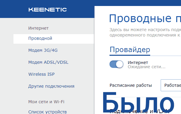
Купил недавно роутер. В большей степени на выбор повлиял приятный новый интерфейс настроек.
Но вот купив, немного смутило меня боковое меню. Строки этого меню выделяются не полностью, как узкими полосками с пропусками между ними, что мне показалось очень неудобно, да и не очень красиво выглядит (хотя во всем интерфейсе отустпы вроде везде нормальные, а тут нет), да еще и текст не по центру этой полоски. Хотелось бы чтобы поправили этот пунктик. Накидал на гифке как это в моем понимании должно быть.
Изменено пользователем SanekK0 ответов на этот вопрос
Рекомендуемые сообщения
Присоединяйтесь к обсуждению
Вы можете написать сейчас и зарегистрироваться позже. Если у вас есть аккаунт, авторизуйтесь, чтобы опубликовать от имени своего аккаунта.
Примечание: Ваш пост будет проверен модератором, прежде чем станет видимым.